Since a while I observe the mainstreamed parallax scrolling trend.
A lot of the research comes from schools of cognitive science and media theory that we relate to objects and virtual environments. A parallax environment is eye-catching and involving because it behaves in a way that is familiar. It follows physical rules we already intuit and understand from real life: e.g. - things farther away/ in the background move slower than things in the foreground. It is nice and fascinating but it is still virtual, has to be interpreted. It’s not so easy or it is often difficult for users especially for non-power-users to navigate and to orientate within this virtual room.
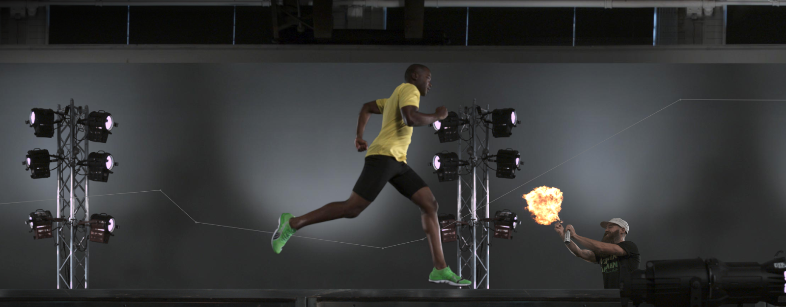
If I am well informed Ian Coyle created the very first parallax website for Nike ‘Nike Better World’ in 2011.
Parallax scrolling basically involves various elements on a page, scrolling at different speeds, causing the elements vertical and / or horizontal position on the page to vary in relation to its surrounding elements.
HTML5 and CSS3 opened up these new possibilities for the web design.
It is a great effect if it serves the user experience and is perfect for storytelling websites. Although already quite popular, the parallax scrolling is not widely used on the web, probably because of various different reasons. And as always you have to balance the cons against the pros when talking about parallax scrolling, but people ignored it for a while while the parallax scrolling hype was happening.
If you consider going this way keep in mind …
With all due respect to the mentioned issues the existing benefits cannot be argued away …
However, everything could backfire if you don’t do it properly. Scrolling too much may annoy or bore the visitors and that would make them leave the site before them seeing what you wanted them to see. And in worst case this strange experience may leave a bad feeling in one’s mind. Another problem that I often discover the usability of the site will drop really significant.
Scrolling is interesting until it is not. I don’t mind scrolling on a website and I’m not necessarily an advocate of the idea that everything important must be above the fold, but scrolling like a mad man to see the end of the site is annoying.
Think about what you’re trying to achieve. What supports your idea and your product or service best – is it really the story you have to tell by this parallaxed storytelling approach? If parallax scrolling is essential and or crucial to your concept and your objectives then go for it – if not, it’s likely that you’re using the technique just for its self-expression and showmanship, or in worst case just for the reason to win an award, and not supporting the objective. And it’s probably taking away more from the user experience, utility and usability of your site than it’s adding to it.
Finally I would like to show you a few well-made examples:
The latest example [2013-nov-22] I'd like to show you is 'The Hobbit: The Desolation of Smaug'
It shows an interactive map of Middle Earth - it has a nifty movie-scrubbing effect used in combination with some parallax scrolling.
http://middle-earth.thehobbit.com/

Virtual lab aims to explain treatments for Alzheimer's and dementia
http://www.dementialab.org/
Fashion:
http://www.nike.com/fall13-app/us/en_us/flyknit

http://www.loisjeans.com/web2012/es

http://krystalrae.com/

http://www.puma.com/mobium/
Art:
http://www.the-bea.st/

Other:
http://journey.lifeofpimovie.com/#!/

http://titanic.q-music.be/

http://www.360langstrasse.sf.tv/page/

Mobile Solutions - And the next example you should check with your tablet:
You can control it by tilting
Non is a killer website but interesting approaches ...
http://wagerfield.github.io/parallax/

http://www.one-potato.co.uk/
I like the smoothness of the parallax. The site uses tilt-o-vision which is essentially an animation that you can control by tilting your tablet device. These animations work on an iPad2 or later. Tilt from side to side (landscape mode)

A lot of the research comes from schools of cognitive science and media theory that we relate to objects and virtual environments. A parallax environment is eye-catching and involving because it behaves in a way that is familiar. It follows physical rules we already intuit and understand from real life: e.g. - things farther away/ in the background move slower than things in the foreground. It is nice and fascinating but it is still virtual, has to be interpreted. It’s not so easy or it is often difficult for users especially for non-power-users to navigate and to orientate within this virtual room.
If I am well informed Ian Coyle created the very first parallax website for Nike ‘Nike Better World’ in 2011.
Parallax scrolling basically involves various elements on a page, scrolling at different speeds, causing the elements vertical and / or horizontal position on the page to vary in relation to its surrounding elements.
HTML5 and CSS3 opened up these new possibilities for the web design.
It is a great effect if it serves the user experience and is perfect for storytelling websites. Although already quite popular, the parallax scrolling is not widely used on the web, probably because of various different reasons. And as always you have to balance the cons against the pros when talking about parallax scrolling, but people ignored it for a while while the parallax scrolling hype was happening.
If you consider going this way keep in mind …
- Elaborating of concept and story
- Sophisticating and tricky to develop from scratch
- Challenging to implement
- Time-consuming and connection-consuming to load
- Loosing users with slow internet connection
- Frustrating of inexperienced users
- Find solutions for mobile devices
- It doesn’t work in general
- You need an alternative – perhaps moving the device etc.
- Or often the display size is even too small
- Solving SEM problem – parallax sites doesn’t go well with SEO
With all due respect to the mentioned issues the existing benefits cannot be argued away …
- Engaging
- Entertaining
- Storytelling
- Joy of use
However, everything could backfire if you don’t do it properly. Scrolling too much may annoy or bore the visitors and that would make them leave the site before them seeing what you wanted them to see. And in worst case this strange experience may leave a bad feeling in one’s mind. Another problem that I often discover the usability of the site will drop really significant.
Scrolling is interesting until it is not. I don’t mind scrolling on a website and I’m not necessarily an advocate of the idea that everything important must be above the fold, but scrolling like a mad man to see the end of the site is annoying.
Think about what you’re trying to achieve. What supports your idea and your product or service best – is it really the story you have to tell by this parallaxed storytelling approach? If parallax scrolling is essential and or crucial to your concept and your objectives then go for it – if not, it’s likely that you’re using the technique just for its self-expression and showmanship, or in worst case just for the reason to win an award, and not supporting the objective. And it’s probably taking away more from the user experience, utility and usability of your site than it’s adding to it.
Finally I would like to show you a few well-made examples:
The latest example [2013-nov-22] I'd like to show you is 'The Hobbit: The Desolation of Smaug'
It shows an interactive map of Middle Earth - it has a nifty movie-scrubbing effect used in combination with some parallax scrolling.
http://middle-earth.thehobbit.com/
Virtual lab aims to explain treatments for Alzheimer's and dementia
http://www.dementialab.org/
Fashion:
http://www.nike.com/fall13-app/us/en_us/flyknit
http://www.loisjeans.com/web2012/es
http://krystalrae.com/
http://www.puma.com/mobium/
Art:
http://www.the-bea.st/
Other:
http://journey.lifeofpimovie.com/#!/
http://titanic.q-music.be/
http://www.360langstrasse.sf.tv/page/
Mobile Solutions - And the next example you should check with your tablet:
You can control it by tilting
Non is a killer website but interesting approaches ...
http://wagerfield.github.io/parallax/
http://www.one-potato.co.uk/
I like the smoothness of the parallax. The site uses tilt-o-vision which is essentially an animation that you can control by tilting your tablet device. These animations work on an iPad2 or later. Tilt from side to side (landscape mode)
Comments
Post a Comment